 Login
Login 
Understanding Data Analytics: What is Data Visualisation?
- 30 Aug 2023

In your data analytics career, you will inevitably work with others who might not have the technical education you do. One of the most important tools in a data analyst’s toolbox is the ability to properly showcase their insights to coworkers, stakeholders, and the public.
Data analysts do this with data visualisation.
In the Digital Age, data visualisation has become important in any data career. The world increasingly revolves around data and the ability to not only analyse data but also visualise it in an appealing way is more important now than ever.
This article will explore the process of data visualisation, highlighting its importance in the tech world and beyond.
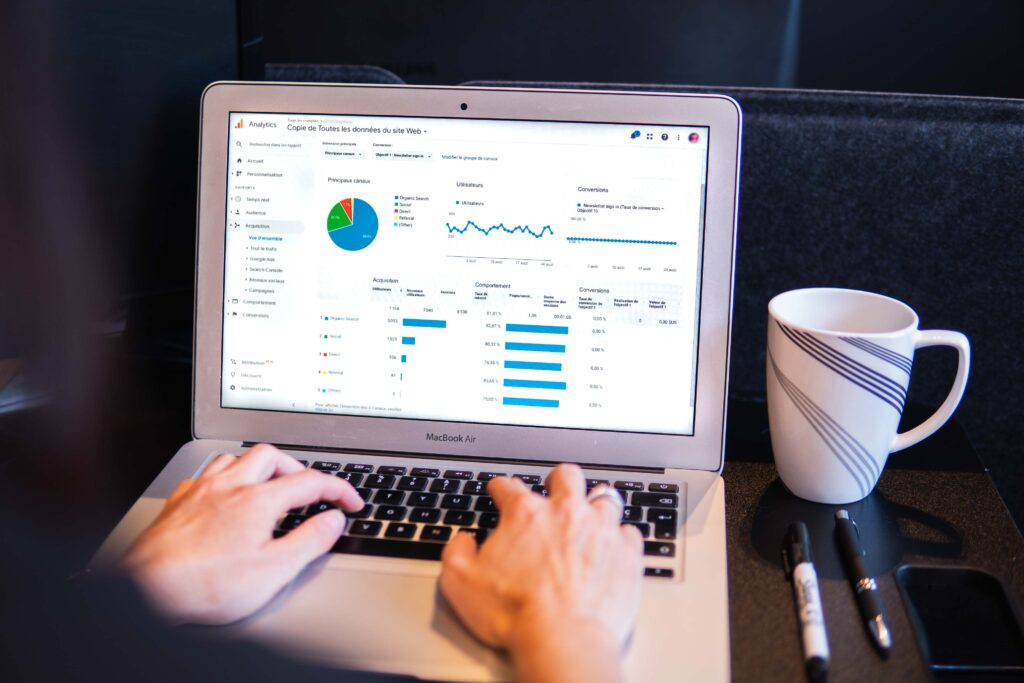
Data Analysts Create Visuals
In order to understand the bridge between data analysis and visualisation, it is important to define each part of the data process.
Data analysis is the process of collecting, cleaning, and analysing data using tools like statistical analysis, machine learning processes, and predictive modelling. Here, data analysts play with huge sets of data to find patterns or trends.
Data visualisation is the process of visually representing insights gained from data using graphs, charts, and maps. With these visualisations, data analysts can clearly communicate the patterns and trends they uncover in data sets in order to help their company make better marketing or production decisions going forward.

Companies like Netflix, for example, will analyse user data in order to identify the best time to launch a tv series or run an advertisement. By parsing through information on user behaviour and preferences, they can determine when their target audience is most likely to engage with a specific piece of content. That is the analysis part of the job.
The insights from this analysis will then be presented in simple, clear, crisp data visualisations that tell stakeholders exactly when to launch said tv series and explains why. With simple visualisations, stakeholders can not only understand the analysis better, but it also helps them to make better-informed decisions based on empirical data.
In short, data analysts use data visualisation techniques to communicate complex information to people. Data visualisation is an essential part of being a data analyst, and is inevitably the difference between a good data analyst and a great one.
Types of Data Visualisations
Websites like Information is Beautiful are great examples of the importance of data visualisation in data analysis. They create impactful infographics and data visuals that are easy to understand in order to communicate complex ideas or data insights. From environmental issues all the way through to box office statistics, they illustrate patterns and trends in data sets in order to tell important stories.
Just by clicking around on their website, you can see the various types of data visualisations that they use to communicate these ideas. Some examples of data visualisations include:
- Charts: These are used to show trends, compare data sets, and track performance. This includes bar charts, pie charts, and line charts.
- Graphs: These show relationships between data points to illustrate a specific pattern or trend. This includes line graphs, histograms, and scatter plots.
- Maps: These visualise spatially-related data, like the distribution of crime in a city, or the spread of an outbreak across the globe. This includes heat maps and topographic maps.
- Infographics: These are the most involved visualisations, as they combine text, images, and charts to tell a nuanced story about data. They are used to combine insights from different data sources that are related and tell a specific story.
Data Visualisation Tools
In order to build data visualisations, there are many different tools and software that make the process simpler. Choosing the correct data visualisation tool for the project you are working on depends on the type of data you want to visualise, the level of interactivity your audience should have with it, the project budget, and your own technical skills.
Some of these data visualisation tools include:
- Tableau: This data visualisation tool is very popular, often used by businesses, governments, and nonprofit organisations. Using Tableau’s many features, you can create interactive dashboards and visualisations to communicate complex information simply.
- Qlik Sense: This tool is known for being speedy and flexible. Using this software, you can create custom visualisations that can be embedded into websites and other applications.
- Power BI: This tool is part of the Microsoft Office suite. It connects users to a variety of data sources to create interactive dashboards and reports.
- Google Charts: This tool can be used to create a variety of charts and graphs, including bar graphs, line graphs, and pie charts. It is a free tool that anyone with an internet connection has unlimited access to.
- Matplotlib: This tool is a Python library that you can use to create a variety of charts and graphs, including line graphs, bar graphs, and scatter plots.
Data Visualisation Creates Value
The most important and obvious value of visualising data lies in communicating insights analysts find in complex data to different stakeholders. In a business setting, this quality is helpful to guide marketing decisions or to determine production schedules.
For example, graphic designers on the marketing team don’t have the time to parse through large sets of data to understand what kinds of design elements users respond well to. It’s the job of a data analyst to create visualisations that clearly communicate the marketing campaigns that have been successful in the past. This can then guide future decisions that the marketing team makes, helping them create more targeted and successful campaigns.
For the production team, the data collected from consumers on who is buying what products helps determine the amount of each product to make in the future. This helps reduce overproduction or underproduction, saving the company time and money.
By tracking sales data and identifying trends and patterns in it, companies can make better decisions about pricing, marketing, and product development overall. It also helps companies generate new ideas by using data to think creatively about their product and their customers.
Summary
As you build your data analytics career, data visualisation is an essential tool to have in your toolbelt. Through visualisations, data analysts can communicate important information about data, helping businesses gain insights that would be impossible to obtain from raw data alone.
When used together, data analysis and data visualisation can be a powerful force for businesses. Using data analysis to find insights and visualisations to communicate those findings, businesses can make better decisions, solve problems, and identify new opportunities.
The first step to your data analysis career starts by enrolling in a data analytics program. ALX Africa’s Data Analytics programme is a great place to start. You’ll learn the skills you need to become a successful and proficient data analyst, including how to take advantage of data visualisation tools to make your data findings have the biggest impact. Enrol today to get started.
FAQs
1. What is data visualisation?
Data visualisation refers to the process of representing data using graphics. This can be done by creating graphs, charts, infographics, or animations in order to communicate the insights gained from datasets.
2. Why is data visualisation important?
When analysing complex data, it can be difficult to communicate the insights clearly. Using data visualisation techniques, you can better illustrate patterns and trends in order to extract important insights. The ability to simplify complex information is essential to help businesses make better decisions in areas like marketing and production.
3. What professions use data visualisation?
Data analysts, data scientists, business intelligence analysts, marketing specialists, and software engineers all use data visualisations in their careers.